
The neighbourhoods hit hardest by COVID-19
The neighbourhoods hit hardest by COVID-19
The different experiences of the pandemic and what this means for our cities

Happy Thursday everyone,
Today, we’re looking at an important question: why is the income of our neighbourhoods connected to rates of COVID-19?
It’s a complicated question - because it connects to a much larger story about economic mobility and access to opportunity that has been developing for decades. One that threatens the vitality of our cities.
Enjoy the read,
-Kapil
When a pandemic sweeps the world, does everyone gets affected equally?
COVID-19 is just a virus. It doesn’t distinguish between national borders, ethnic groups, or particular neighbourhoods, right?
We’ve always used maps to guide our collective journey. But as the events of the last few months have revealed, the maps we’ve been using for the last decade have been dangerously wrong – from our health care system, to the economic health of our middle class, to learning from SARS, and building trust in our country.
These maps have led us to a worrying destination. And there’s no greater example than the map of COVID-19’s impact on individual communities.
COVID-19 is not an ‘equal opportunity’ pandemic. It is infecting – and killing – Canadians very differently. And it has everything to do with your income, your race, and what neighbourhood you live in.
While Toronto is today’s focus, the same experience is playing out in every major western city. And in most cases – especially in the United States – the impacts are even sharper and more worrying.
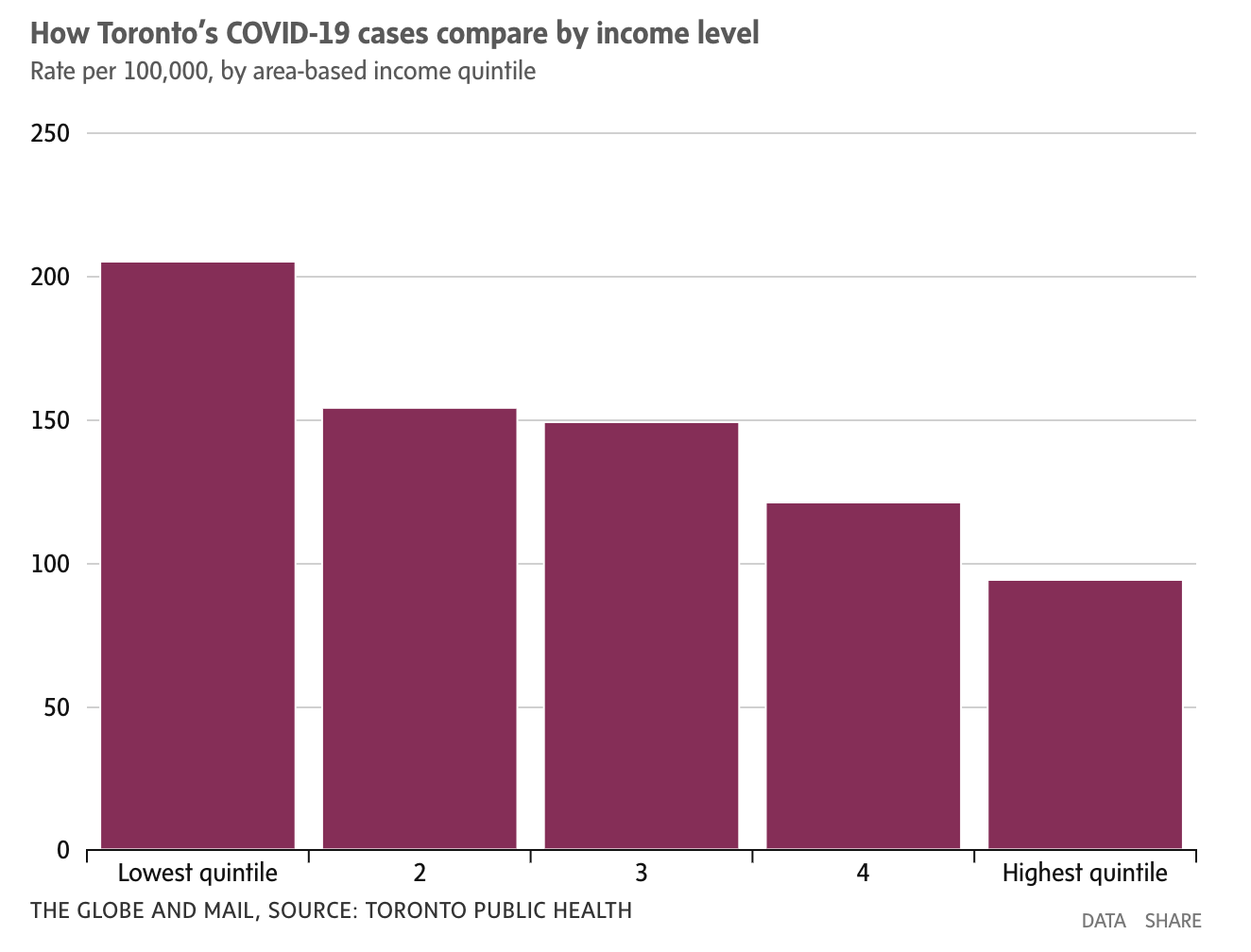
In Toronto, the rates of COVID-19 are not equal amongst neighbourhoods in our city – not by far.
Neighbourhoods with the lowest incomes, highest unemployment rates and highest concentration of immigrants have double the cases of COVID-19.
It’s so stark is bears repeating: The poorest 20% of neighbourhoods have double the cases as the richest 20% of neighbourhoods. Ditto for neighbourhoods with high unemployment rates. Ditto for neighbourhoods with high concentrations of immigrants.
A recent analysis of Toronto Public Health data separated neighbourhoods into five groups based on income level.
Our province does not collect race-based data (but the City has decided to unilaterally push ahead). But we already know what the data will say - our poorest neighbourhoods are also the neighbourhoods with the most visible minorities.
We can also look to other cities as examples. For example, in Chicago, African Americans make up 30% of the population but 70% of COVID-19 related deaths.
Somehow, COVID-19 seems to have ‘targeted’ specific groups of Torontonians. It’s going after the poorest, the most recently immigrated, and visible minorities.
Why is COVID-19 infecting neighbourhoods based on their income level?
This is not just about poverty. The rates of COVID-19 increase steadily as you go from the richest 20% to the poorest 20%. If you are in the middle class, your rate of infection is 60% higher than the richest 20%. Everyone is affected.
A virus can’t target any particular person or community of people for infection. That’s not how viruses work.
But the way you avoid COVID-19 is by locking down at home and only leaving when you absolutely need to.
This isn’t something that everyone can do.
As you move down the scale from the wealthiest workers to the poorest, a different set of realities emerge.
The reality of many workers is that they have to work – or they can’t stay in their homes.
The reality of many workers is that they have to leave their homes for work. They work in services – as taxi drivers, grocery clerks, in long-term-care homes or as janitors.
And the reality of many workers is that they often work in industries where physical distancing is impossible. Sometimes, they have been mandated to work by their employers.
And these realities become more and more evident the farther down the income scale you travel.
These realities mean that the risk of COVID-19 infections for lower-income workers is much greater than higher-income workers – who can work from home.
For example, there have been significant outbreaks recorded in slaughterhouses. Another example: the rolling closure of grocery stores due to outbreaks.
And lower-income workers are much more likely to live in smaller homes, and in multi-generational households. This means their families are much more likely to catch COVID-19 from them.
Service workers form the backbone of our economy. They – literally – are keeping our cities running.
And they, their families and their neighbourhoods are paying a huge price.
How did we get here?
Remember the chart that showed COVID-19 infections based on income-level of neighbourhoods?

We’ve been focusing on the number of infections and why that’s happening.
There’s another important question: how different are the poorest and richest neighbourhoods?
Are our lower-income, risk-exposed workers all concentrated in the same neighbourhoods, and our higher-income, work-from-home workers all in different neighbourhoods?
The answer is yes.
We often think about Toronto as one city. That it’s diverse all over, solidly middle class, and united in purpose. But the reality is that when it comes to income, our neighbourhoods are separate from each other.
Because income tracks race, Toronto is increasingly separated by race.
Because both track recent immigration status, Toronto is also increasingly separated by this as well.
The reality is that we are not one flock, but many. Toronto is increasingly a city of solitudes.
COVID-19’s impact is just tracking along fault lines that have been developing for years.
This reality may be surprising to you, but it comes as no surprise to the experts who have studied income and the geography of Toronto.
Changing neighbourhoods
Over the last several years, The United Way of Greater Toronto has published a series of reports called The Opportunity Equation.
The researchers behind these reports have asked two very important questions:
First, how has neighbourhood income changed over time?
Second, to what degree has ‘income sorting’ happened – low income and high-income earners separating into different neighbourhoods?
This map shows Toronto in 1980, and breaks neighbourhoods into 5 different income categories. The categories are based on how different that neighbourhood’s income is to the city’s average. They range from dark red (significantly below the average) to yellow (hovering around the average) to dark blue (significantly above the average)
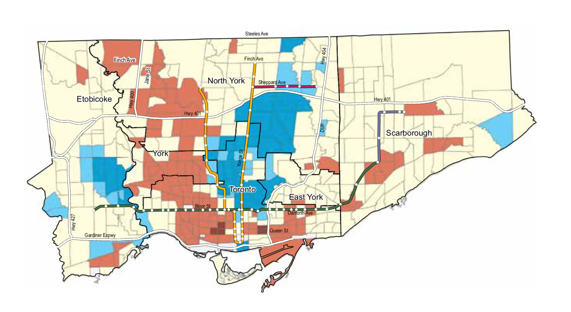
In 1980, Toronto has very few instances of dark red. There are some very wealthy areas of the city. But most of the city is solidly middle class. Meaning, most neighbourhoods have a mix of incomes.
Now let’s take a look at the same map, updated to 2015.
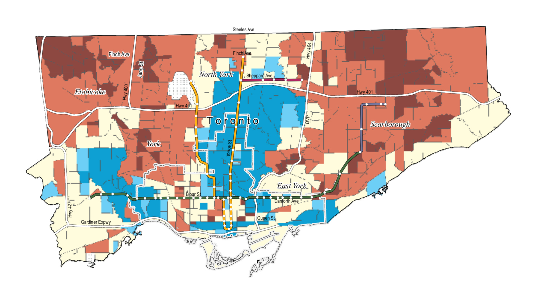
Wow, right? There is almost no yellow left. There is far more red and dark red.
Middle-class Toronto has all-but disappeared.
These middle-income neighbourhoods used to cover 60% of the city and now have dropped by half.
Very-low income neighbourhoods barely made up 1% of the city in 1980, and are now 15%.
Remember that race tracks income. Visible minorities make up 18% of the neighbourhoods shaded blue. They make up 66% of the neighbourhoods shaded red.
The researchers measured ‘neighbourhood inequality’ – the degree to which neighbourhoods have uneven wealth distributions. Neighbourhood inequality has doubled. This is during a time period when Canada’s overall rate of inequality has only increased by 10%.
These trends have extended to all of Toronto’s outer suburbs (the 905 area-code).
And these trends have repeated in all of Canada’s other major cities.
It’s as if there are now three different cities within Toronto. A shrinking middle-class city. A rapidly growing lower-income city. And a modestly growing wealthy city. Each with their own very different lived experience of our society.
And each with their own very different lived experience of this pandemic.
Because COVID-19 tracks income – so this map is also the map of the pandemic’s disproportionate impact on certain neighbourhoods.
It’s a map we’ve been building together over the last several decades. And as we continue to follow this route, it’s leading us to a destination that should cause us all to worry, a lot.
Neighbourhoods and opportunity
What eventually happens when a city separates by income, with higher-income residents and lower-income residents living in their own neighbourhoods?
The “Opportunity Equation” breaks down.
Barack Obama has called the growth of income inequality the ‘defining challenge of our time’ for exactly this reason.
Our society is built on a rather simple equation:
Effort + Opportunity = Success
This equation is the foundation of our Canadian Dream. If we work hard, we can build a great life for ourselves, and our families. It’s what has enabled thousands of families to establish themselves with a stable, middle-class life. And to offer their kids a chance for an even brighter future.
But there are two components to this equation: Effort and Opportunity.
We’re most familiar with Effort – ‘you reap what you sow’. If you work hard, you get ahead. Effort is a personal choice.
We’re less familiar with Opportunity. It’s not a personal choice – it’s our circumstances. The things we are born into, and have limited control over.
Circumstances like: access to quality education, access to a quality job, access to quality health care, access to quality housing, and meaningful social networks.
Opportunity are all the things that enable you to exert your maximum Effort. The stability of your material circumstances. The stability of your social circumstances. The stability of your psychological circumstances. In other words, your well-being.
Opportunity enables your Effort. It’s the difference between running on a flat surface, and running on a steep incline.
The circumstances of Toronto in the 1980s were very different from the circumstances of Toronto today.
When a city splits into income-based neighbourhoods, circumstances change significantly.
Is every public school of equally high quality anymore, or is it different from wealthier neighbourhoods to poorer neighbourhoods?
Do lower-income neighbourhoods have equal access to high quality health care?
Is housing affordable across the city?
But perhaps the most challenging of all: do the social networks of these now-separate communities reinforce themselves? Do these separated social networks enable more opportunity in wealthier neighbourhoods, and less opportunity in lower-income neighbourhoods?
When the United Way conducted this study, they asked a sampling of Torontonians questions about how they saw opportunity.
A majority felt that hard work was not a guarantee for success.
A majority felt that their background and circumstances were a barrier to a good future
A majority felt that the next generation would be worse off.
This isn’t just about COVID-19’s disproportionate impact on particular neighbourhoods. This impact tracks along the fault lines of access to opportunity that have been developing for decades.
Where does this map lead?
If you pay close attention to the politics of our city, you may have noticed that the 2015 income map connects strongly to the vote-maps of two very important recent elections. When the populist premier Doug Ford was elected to lead our province in 2018. And when the populist mayor, Rob Ford, was elected to lead our city in 2010.
But remember, populism is not a great term:
Voters are voting based on how they feel. And for years now, they have been feeling increasingly left out, increasingly alienated, and increasingly left behind. They have felt the breaking-down of the opportunity equation.
But this goes far beyond politics.
This map has even more worrying implications for the economic health of our country.
Our society is built on capitalism, the buying and selling of things. It’s the most efficient and effective way we’ve found to organize ourselves.
But capitalism only works when people can afford to buy things, without going into debt. When half of our country is living paycheque-to-paycheque, this engine breaks down.
It breaks down further still when neighbourhoods are separated based on income.
Entrepreneurship is critical to making the next generation better off. How does a budding entrepreneur access the social networks that are so critical to getting a new business off the ground?
The kind of economic mobility that Canada has become known for around the world only happens when there is enough opportunity to go around for everyone.
Success = Effort + Opportunity
Opportunity has a long ‘cycle time’. The vibrant economy we enjoy today was produced by the opportunity we experienced in the 80s and 90s. The entrepreneurs of that generation are today’s executives. The kids of that generation are today’s entrepreneurs and budding business leaders.
If the opportunity equation has fragmented today, what does that mean for the future health of our business community?
A lack of opportunity goes straight to the heart of our economy.
How do we build a better map?
It starts by acknowledging that the geographic impact of COVID-19 is a symptom of a much larger problem.
It’s a problem that has been building for decades. We see this same problem in the economic fragility of our middle class. And in declining levels of trust. It’s a problem that threatens the social and economic vitality of our country.
And it all centres around opportunity.
We need to re-build the opportunity equation. That requires a critical look at all of the factors that enable access to opportunity. Factors like: health care, education, transit, housing, job quality. We need to understand how they’ve deteriorated over the last several decades. And we need to understand what’s required in order to repair these cracked foundations.
Because only with access to opportunity can the next generation enjoy the same kinds of successes as previous generations.
This can feel intangible, so let’s zoom in on just one area: transit. Did you notice that the wealthiest (or most rapidly gentrifying) neighbourhoods in the map almost perfectly overlaid our transit system?

Transit access is a major enabler of opportunity. A shorter commute means more time with your family. More time with your family translates into a whole host of benefits. Benefits such as improved mental health, sleep, and more time with your kids and their homework. In other words, greater opportunity for you and the next generation.
But there’s not enough access to transit in Toronto, so access goes to the highest bidder. Wealthier families can afford to live near transit, poorer families can’t. And suddenly, this dimension of opportunity becomes unequally distributed.
You can also see how to repair this cracked foundation: just build more transit – it is that simple.
Repeat this from dimension to dimension of opportunity, and you start to see how the opportunity equation can be built back up.
COVID-19 is breaking over fault lines that have been developing for decades – a city separated by income, where your access to opportunity increasingly tracks your postal code.
As manage through this pandemic, let’s remember that this map does not have to define our future.
We can choose to build a different map. One that leads to a ladder of opportunity.